
The £2,000 Colour Mistake: When Trendy Goes Wrong
“I thought I was being bold and contemporary,” admitted Sarah Chen, looking at the bright turquoise window frames on her Victorian terrace in Hertford. “The colour looked amazing in the brochure, and the installer assured me it was ‘very on-trend.’ But eighteen months later, I’m getting quotes to change them because they look dated already, and every estate agent says they’ll hurt the resale value.”
Sarah’s experience illustrates the challenge of choosing window colours that balance current trends with long-term appeal. What seems fresh and exciting today can quickly become tomorrow’s decorating regret, especially when that regret is literally built into your home’s exterior for decades.
The window colour landscape has evolved dramatically over the past decade. Where white once dominated the market with occasional forays into brown or green, today’s homeowners choose from an extensive palette that includes everything from sophisticated greys to bold statement colours. This explosion of choice brings both opportunities and risks that require careful consideration.
After nearly four decades of helping homeowners navigate colour choices—and witnessing both triumphant transformations and expensive mistakes—I’ve learned that successful window colour selection balances personal taste with practical considerations including architectural compatibility, neighbourhood context, and long-term appeal.
The good news is that 2025’s trending colours offer sophisticated options that combine contemporary appeal with lasting elegance. Understanding these trends, how they work with different materials and architectural styles, and their likely longevity helps make colour choices you’ll love for decades rather than regret in months.
Let me guide you through 2025’s most compelling window colour trends and show you how to choose colours that enhance both your home’s beauty and its value.
The Psychology of Window Colour Choice
Window colours do more than simply frame views—they fundamentally alter how we perceive buildings and the emotions they evoke. Understanding colour psychology helps explain why certain shades trend while others fall from favour, and why some colours feel timeless while others quickly date.
Darker colours like anthracite grey and charcoal create visual weight and sophistication, making buildings appear more substantial and contemporary. These colours recede visually, allowing architectural details to take prominence while creating crisp contrast with lighter wall colours. The psychological impact is one of confidence, stability, and modern elegance.
Lighter colours such as cream and soft whites reflect more light, making buildings appear larger and more welcoming. These colours advance visually, drawing attention to window proportions and creating a sense of openness and airiness. The psychological response tends toward feelings of cleanliness, simplicity, and classic elegance.
Natural colours including sage green and warm greys connect buildings to their landscape context, creating harmony between built and natural environments. These colours work particularly well in rural settings or properties with significant garden contexts, evoking feelings of tranquility and environmental consciousness.
The trend toward more complex, sophisticated colours reflects broader cultural shifts toward individuality and environmental awareness. Homeowners increasingly seek colours that express personal taste while connecting to natural environments, moving away from the stark whites that dominated previous decades.
Understanding these psychological impacts helps predict which trends will endure and which may prove temporary. Colours that evoke positive emotions while working harmoniously with architectural context tend to maintain appeal longer than those chosen purely for novelty or shock value.
2025’s Leading Colour Trends
This year’s window colour trends reflect a sophisticated maturation of the market, with homeowners choosing colours that balance contemporary appeal with long-term elegance. The standout trends combine visual impact with practical versatility.
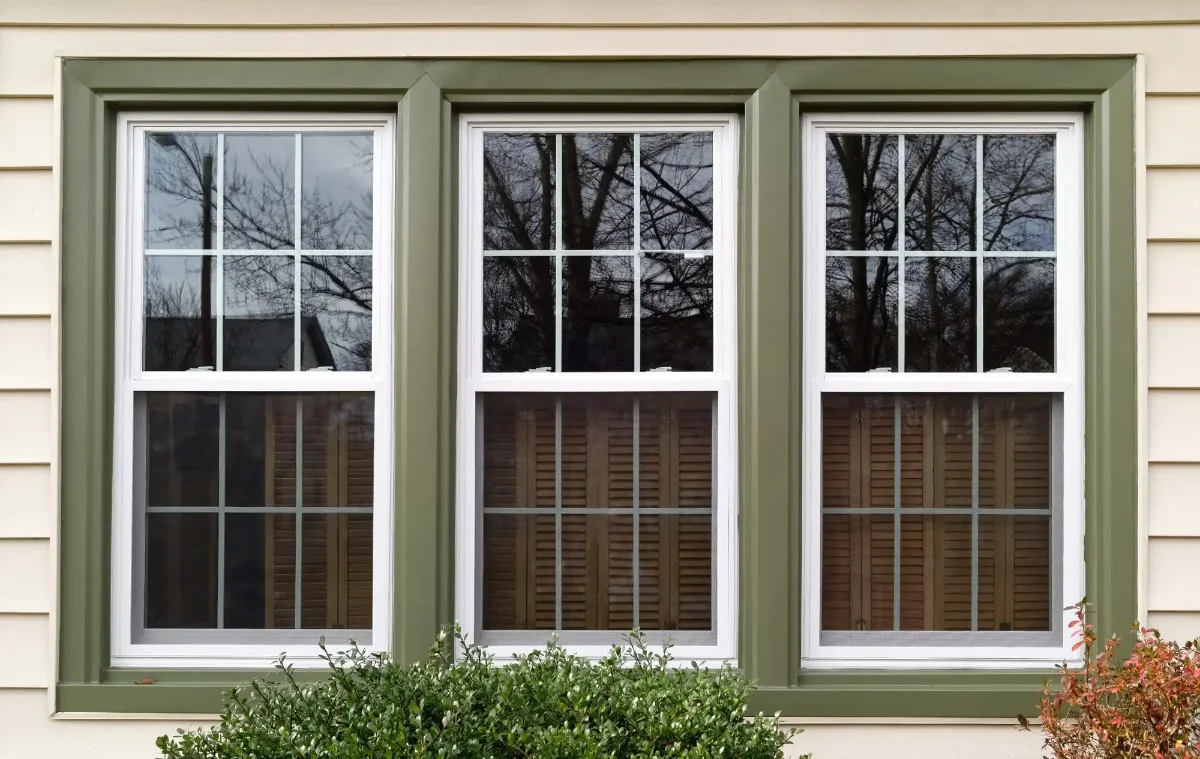
Anthracite Grey: The New Black Anthracite grey has evolved from trendy newcomer to established classic, offering the sophistication of black without its heat absorption issues or maintenance challenges. This deep, complex grey works beautifully with both traditional and contemporary architecture, providing dramatic contrast with light-coloured walls while maintaining enough subtlety to avoid overwhelming smaller properties.
The colour’s popularity stems from its incredible versatility. Anthracite grey complements virtually any wall colour, from classic white render to natural stone, red brick to timber cladding. It works equally well with traditional Georgian proportions and contemporary floor-to-ceiling glazing, making it a safe choice for diverse architectural styles.
Sage Green: Nature’s Sophistication Sage green represents the growing trend toward biophilic design and environmental consciousness. This muted, sophisticated green connects homes to their landscape context while offering a refreshing alternative to ubiquitous greys. The colour works particularly well in rural settings and properties with significant garden contexts.
The appeal of sage green lies in its complexity—neither too blue nor too yellow, it shifts subtly in different lights while maintaining its essential character. This chameleon quality prevents the colour from becoming tiresome while ensuring it photographs beautifully in varying conditions.
Cream and Off-White: Warm Minimalism The trend toward warmer whites reflects a reaction against the stark, cold whites that dominated previous decades. Cream and off-white shades provide the clean, classic appeal of white while adding warmth and sophistication that works better with natural materials and varied lighting conditions.
These colours work particularly well in heritage contexts where pure white can appear too harsh or contemporary. They also photograph beautifully, making them popular choices for properties likely to be marketed or featured in media.
Charcoal and Deep Grey: Urban Sophistication Deeper than anthracite but lighter than black, charcoal greys offer urban sophistication that works particularly well in contemporary settings. These colours create strong architectural statements while maintaining enough subtlety to work with varied colour schemes and architectural details.
Heritage Green: Traditional with a Twist Traditional green shades updated with contemporary sophistication appeal to homeowners seeking colours with historical precedent but modern relevance. These colours work particularly well with period properties and conservation area requirements while feeling fresh rather than dated.
For expert guidance on colour selection that complements your architectural style, our aluminium window specialists understand how different colours work with various frame materials and architectural contexts.
Material Compatibility and Performance
Different window frame materials handle colour differently, with implications for both appearance and longevity that significantly affect colour choice decisions. Understanding these material characteristics helps optimize colour selection for specific applications.
Timber Frame Colour Options Timber offers the greatest colour flexibility, accepting virtually any paint or stain system with appropriate preparation. This flexibility allows for precise colour matching, custom shades, and easy colour changes throughout the window’s life. However, timber’s organic nature means colours may appear slightly different on different grain patterns or wood species.
The natural texture of timber adds depth and interest to painted finishes, preventing flat, artificial appearances that can occur with smooth materials. This texture particularly benefits darker colours, adding visual richness that enhances rather than overwhelms architectural details.
Maintenance considerations for timber colours include the need for periodic repainting, typically every 5-8 years depending on exposure and quality of initial finish. However, this maintenance requirement also provides opportunities for colour updates that keep properties looking fresh and contemporary.
uPVC Frame Colour Performance Modern uPVC systems offer extensive colour options through co-extrusion, lamination, or specialized coating systems. Factory-applied colours generally provide superior durability and finish quality compared to field-applied systems, with many manufacturers offering 10-15 year colour warranties.
Co-extruded colours integrate colour throughout the material thickness, providing excellent durability and consistent appearance even if surface damage occurs. However, colour options are typically limited to manufacturers’ standard ranges, restricting custom colour possibilities.
Laminated finishes offer broader colour options including wood-grain effects and metallic finishes. These systems provide excellent appearance and durability but may be vulnerable to edge wear in high-traffic areas or extreme weather conditions.
Heat absorption becomes a critical consideration with darker uPVC colours, particularly in south-facing applications. Dark colours can cause significant thermal expansion that may affect hardware operation and seal performance, requiring careful specification and installation.
Aluminium Frame Colour Excellence Powder coating provides aluminium frames with exceptional colour durability and finish quality. The electrostatic application process creates uniform, durable finishes that resist fading, chalking, and weathering better than most other colour systems.
The smooth surface of aluminium provides excellent colour clarity and consistency, making it ideal for precise colour matching and contemporary colour schemes. The material’s thermal stability also ensures consistent colour appearance across varying temperatures and exposures.
Colour options for aluminium frames are virtually unlimited through custom powder coating, though standard colour ranges offer excellent choices for most applications. The ability to achieve precise colour matches makes aluminium ideal for projects requiring specific colour coordination.
Composite Frame Considerations Composite frames typically combine timber interiors with aluminium or uPVC exteriors, creating colour specification challenges that require coordination between different material systems. However, this combination also offers opportunities for contrasting interior and exterior colours that can enhance both internal and external aesthetics.
The exterior cladding material determines colour performance and maintenance requirements, while interior timber allows for different colour treatments that complement internal decoration schemes. This flexibility appeals to homeowners seeking sophisticated colour coordination throughout their properties.
Architectural Style Compatibility
Successful window colour selection requires understanding how colours interact with different architectural styles and periods. What works beautifully on a contemporary build may look inappropriate on a Georgian terrace, while colours perfect for rural cottages might seem out of place in urban settings.
Georgian and Regency Properties Traditional Georgian and Regency architecture benefits from colours that respect historical precedent while offering contemporary sophistication. White and cream remain classic choices that enhance the mathematical precision of Georgian proportions, while darker colours can provide dramatic contrast that emphasizes architectural details.
Anthracite grey works particularly well with Georgian architecture, providing contemporary sophistication while respecting the formal, symmetrical character of these buildings. The colour enhances rather than competes with classical proportions and decorative elements.
Heritage greens offer historically appropriate alternatives that feel fresh rather than pastiche. These colours work particularly well in conservation areas where planning authorities may prefer colours with historical precedent.
Victorian Properties Victorian architecture’s varied character and decorative richness provides opportunities for more adventurous colour choices. The period’s original polychromatic approach to building colour supports contemporary interpretations that balance historical reference with modern sophistication.
Sage green works beautifully with Victorian properties, particularly those in garden settings or rural contexts. The colour complements the period’s connection to nature and garden design while providing contemporary relevance.
Charcoal and deep greys enhance Victorian architectural details while providing contemporary sophistication. These colours work particularly well with red brick or natural stone, creating dramatic contrast that emphasizes decorative elements.
Edwardian and Arts & Crafts Properties The Arts & Crafts movement’s emphasis on natural materials and harmony with landscape makes it particularly compatible with nature-inspired colours. Sage green and warm greys work beautifully with these properties, enhancing their connection to garden and landscape contexts.
Cream and off-white colours complement the movement’s preference for natural, understated elegance while providing contemporary sophistication. These colours work particularly well with timber-framed or rendered properties typical of the period.
Contemporary and Modern Properties Contemporary architecture’s clean lines and minimalist aesthetic support bold colour choices that might overwhelm period properties. Anthracite grey and charcoal provide sophisticated contrast with contemporary materials while maintaining the clean, uncluttered aesthetic these buildings require.
The flexibility of contemporary design also supports more adventurous colour combinations, including contrasting frame and glazing bar colours or coordinated colour schemes that extend to other building elements.
Rural and Cottage Properties Rural properties benefit from colours that connect to their landscape context while respecting traditional building forms. Sage green and heritage greens work particularly well in these settings, creating harmony between buildings and their natural surroundings.
Warm creams and off-whites enhance the cozy, welcoming character of cottage properties while providing practical benefits in terms of heat reflection and maintenance accessibility.
Regional Considerations and Planning Constraints
Window colour choices must consider not just personal preference and architectural compatibility, but also regional context and potential planning constraints that may limit colour options or require specific approvals.
Conservation Area Requirements Conservation areas often have specific guidelines regarding window colours, with some areas requiring traditional colours while others may be more flexible about contemporary interpretations. Understanding local requirements before colour selection prevents costly mistakes and potential enforcement issues.
Many conservation areas maintain approved colour palettes that balance historical appropriateness with contemporary needs. These palettes often include sophisticated interpretations of traditional colours that provide contemporary appeal while meeting conservation requirements.
Some conservation areas require planning permission for colour changes, particularly on prominent elevations or buildings that contribute significantly to area character. Early consultation with conservation officers helps identify requirements and opportunities for appropriate colour choices.
Listed Building Considerations Listed buildings typically face more stringent colour requirements, with changes often requiring listed building consent. However, many listing authorities recognize that appropriate colour choices can enhance rather than harm building character, provided they respect historical context and architectural significance.
Professional heritage advice often proves valuable for listed building colour selection, helping identify colours that meet conservation requirements while achieving contemporary appeal. This advice can also support planning applications where necessary.
Neighbourhood Context Successful colour choices consider neighbourhood context and local character, ensuring that individual properties enhance rather than jar with their surroundings. This doesn’t mean uniformity, but rather thoughtful colour selection that respects local character while expressing individual taste.
Market research in your area can reveal local colour preferences and identify combinations that work well with prevalent architectural styles and local materials. This research helps ensure colour choices enhance rather than limit property appeal.
Climate and Environmental Factors Local climate conditions affect colour performance and longevity, with coastal areas requiring colours that resist salt corrosion while sunny locations need colours that resist UV fading. Understanding these factors helps optimize colour selection for local conditions.
Environmental considerations including air quality, prevailing weather patterns, and seasonal light variations all affect how colours appear and perform over time. Professional advice can help identify colours that work well in specific environmental conditions.
For comprehensive guidance on colour selection that meets conservation requirements while achieving contemporary appeal, our timber window specialists understand both heritage constraints and modern colour possibilities.
The Business of Colour: Costs and Considerations
Window colour choices have financial implications that extend beyond initial purchase costs to include maintenance requirements, potential resale impact, and long-term performance considerations. Understanding these economic factors helps make colour decisions that optimize both immediate satisfaction and long-term value.
Premium Pricing for Colour Coloured window frames typically cost 10-25% more than standard white equivalents, with premium colours commanding the highest premiums. Anthracite grey, being the most popular alternative to white, often falls in the middle of this range at 15-20% premium.
Custom colours generally command the highest premiums, often 25-50% above standard colours. However, custom colours may be necessary for heritage properties or specific architectural requirements where standard colours don’t provide appropriate matches.
The premium for colour varies significantly between manufacturers and materials, with some suppliers offering extensive colour ranges at modest premiums while others charge substantial amounts for any deviation from white. Comparing colour premiums across suppliers can reveal significant savings opportunities.
Maintenance Cost Implications Different colours have varying maintenance requirements that affect long-term ownership costs. Darker colours may show dust and water marks more readily, requiring more frequent cleaning to maintain appearance.
Lighter colours typically hide minor wear and weathering better than darker shades, though they may show dirt and staining more readily. Understanding these maintenance characteristics helps plan appropriate care schedules and budget for ongoing maintenance.
Some colour systems offer better durability and lower maintenance requirements, justifying higher initial costs through reduced long-term care needs. Professional advice can help identify colour systems that provide the best balance of initial cost and long-term value.
Resale Value Considerations Window colour choices can significantly impact property marketability and value, with some colours enhancing appeal while others may limit buyer interest. Understanding market preferences helps optimize colour choices for long-term value.
Neutral, sophisticated colours like anthracite grey and sage green typically enhance property appeal by demonstrating contemporary taste while maintaining broad market appeal. These colours often photograph well for marketing purposes while appealing to diverse buyer preferences.
Bold or highly personal colours may limit property appeal, particularly in conservative markets or areas where traditional colours predominate. However, the right bold colour in an appropriate context can also create memorable, desirable properties that command premium prices.
Insurance and Warranty Implications Some colour systems may affect warranty terms or insurance coverage, particularly if colours are applied after manufacturing or if non-standard colour systems are used. Understanding these implications helps avoid potential coverage issues.
Professional colour application and appropriate colour systems typically maintain full warranty coverage while providing insurance benefits through enhanced property value and appeal. However, DIY colour changes or inappropriate systems may void warranties or affect insurance coverage.
Colour Combinations and Coordination
Successful window colour schemes often involve coordination with other building elements including doors, fascias, guttering, and architectural details. Understanding how to create cohesive colour schemes enhances overall property appearance while avoiding colour conflicts.
Monochromatic Schemes Using single colours in different shades and intensities creates sophisticated, cohesive appearances that work well with varied architectural styles. Anthracite grey windows with charcoal doors and light grey render creates depth and interest while maintaining visual unity.
Monochromatic schemes work particularly well with contemporary architecture where clean, uncluttered appearances are desired. These schemes also photograph beautifully and typically age well without appearing dated.
Complementary Colour Combinations Pairing colours from opposite sides of the colour wheel creates dynamic, visually interesting combinations that can enhance architectural features. Sage green windows with warm cream walls creates a natural, harmonious combination that works well in garden settings.
Complementary schemes require careful balance to avoid overwhelming smaller properties or creating jarring contrasts. Professional colour advice helps optimize these combinations for specific architectural contexts.
Analogous Colour Schemes Using colours that sit adjacent on the colour wheel creates harmonious, sophisticated combinations that feel natural and restful. Various greys and greens work well together, creating depth without conflict.
These schemes work particularly well with complex architectural details where multiple colours need to work together harmoniously. They also provide flexibility for future colour changes while maintaining overall scheme coherence.
Accent and Feature Colours Using different colours for windows and doors or highlighting specific architectural features creates visual interest while maintaining overall scheme coherence. Anthracite grey windows with sage green doors provides contemporary sophistication with natural warmth.
Accent colours work particularly well with larger properties where single colours might appear monotonous. However, they require careful coordination to avoid creating busy or conflicted appearances.
Material-Based Coordination Coordinating colours with natural materials including brick, stone, timber, and roofing creates harmonious schemes that feel integrated rather than applied. Understanding how colours work with existing materials helps create successful coordination.
This approach works particularly well with heritage properties where respecting existing materials is important for both aesthetic and conservation reasons. Professional advice can help identify colours that enhance rather than compete with natural materials.
Future-Proofing Your Colour Choice
Making window colour choices that remain appealing and appropriate for decades requires understanding both current trends and their likely evolution. Future-proofing colour choices protects investments while ensuring long-term satisfaction.
Trend Longevity Analysis Some colour trends prove temporary while others establish lasting appeal. Anthracite grey’s eight-year popularity suggests staying power that extends beyond temporary fashion, while more extreme colours may prove shorter-lived.
Understanding the drivers behind colour trends helps predict their longevity. Colours that respond to practical needs like energy efficiency or maintenance reduction tend to last longer than those driven purely by fashion considerations.
Classic Colour Principles Colours that work with fundamental design principles including proportion, contrast, and harmony tend to maintain appeal longer than those that depend on temporary fashion trends. Understanding these principles helps identify colours with lasting appeal.
Natural colour inspirations typically age better than artificial or highly processed colours. Colours that connect to landscape, natural materials, or traditional pigments often maintain relevance across changing fashion cycles.
Flexibility and Adaptability Choosing colours that work with varied decoration schemes and architectural modifications provides flexibility for future changes without requiring complete colour scheme overhauls. Neutral, sophisticated colours typically offer this adaptability.
Understanding how colours might be modified or updated in future helps plan for potential changes. Timber frames offer the greatest flexibility for colour updates, while other materials may require more extensive work for colour changes.
Technology and Innovation Advancing colour technology continues to expand options while improving performance and durability. Understanding these developments helps make choices that benefit from current technology while remaining compatible with future innovations.
Smart glass and dynamic glazing technologies may influence future window colour choices, with frames needing to complement changing glass appearances. Considering these possibilities helps future-proof colour decisions.
Making Your Colour Decision
Successful window colour selection balances personal taste with practical considerations including architectural compatibility, neighbourhood context, maintenance requirements, and long-term appeal. A systematic approach to colour selection helps optimize outcomes while avoiding expensive mistakes.
Assessment and Planning Begin with thorough assessment of your property’s architectural style, neighbourhood context, and existing colour palette. Understanding these factors provides the foundation for appropriate colour selection that enhances rather than conflicts with existing elements.
Consider your long-term plans for the property including potential modifications, decoration changes, and resale timeline. These factors influence the appropriateness of different colour choices and help prioritize immediate appeal versus long-term flexibility.
Professional Consultation Professional colour consultation can provide valuable perspective on colour choices, particularly for complex properties or challenging colour coordination requirements. This consultation often pays for itself through improved outcomes and avoided mistakes.
Understanding local planning requirements and conservation constraints early in the selection process prevents costly mistakes and ensures chosen colours will receive necessary approvals.
Testing and Visualization Physical colour samples viewed in actual lighting conditions provide much better colour assessment than brochures or digital representations. Most manufacturers provide sample services that allow proper colour evaluation before commitment.
Digital visualization tools and professional rendering services can help visualize colour choices in context, though these should supplement rather than replace physical sample evaluation.
Quality and Specification Prioritize quality colour systems that provide durability and consistent appearance over cheaper alternatives that may fade, chalk, or require frequent maintenance. The premium for quality colour systems typically proves worthwhile through better long-term performance.
Understanding warranty terms and maintenance requirements for different colour systems helps make informed decisions about long-term ownership costs and responsibilities.
Planning for the Future Consider how colour choices might age and whether they can be modified or updated if preferences change. This planning helps ensure satisfaction throughout the window’s operational life while protecting property value.
Document colour specifications and maintenance requirements for future reference, ensuring that touch-up work and maintenance can be completed with appropriate materials and techniques.
Ready to explore 2025’s trending window colours for your property? Contact our colour specialists for professional consultation, sample coordination, and expert advice on colour choices that enhance your home’s beauty and value.
Because the right window colour doesn’t just frame your view—it frames your home’s character, your neighbourhood presence, and your long-term satisfaction with one of your property’s most visible and important features.
Your windows are a statement about your taste, your home, and your place in the community. Make sure that statement is one you’ll be proud of for decades to come.
Choose colours that speak to you today while respecting the timeless principles that ensure lasting appeal. The perfect window colour is out there—let’s find it together.